Transport for Wales
2026
Designing the next generation of rail retail tools
A new retail ecosystem designed around the people who sell tickets every day — from conductors moving through trains to sales operators working at ticket offices.
Team & my role:
As Lead Product Designer, I worked closely with a Product Designer and six cross-functional engineering and specialist teams. I coordinated design delivery across six workstreams, led user research, and owned the design process from discovery through delivery.

Overview
A complex system behind every simple sale
Selling a UK train ticket means navigating routes, operators, ticket types, restrictions, railcards, passenger combinations and fulfilment methods—all while the customer waits. For Transport for Wales, this complexity was compounded by two distinct working environments: conductors selling tickets on the move, often with limited connectivity and constrained by the capabilities of a handheld device, and ticket-office staff handling a broader range of complex requests.
The challenge wasn’t simply to modernise existing tools. It was to understand the practical limitations of each environment, identify what information people need at every stage and make a complex retail system feel manageable.
Research
Understanding rail retail in the real world
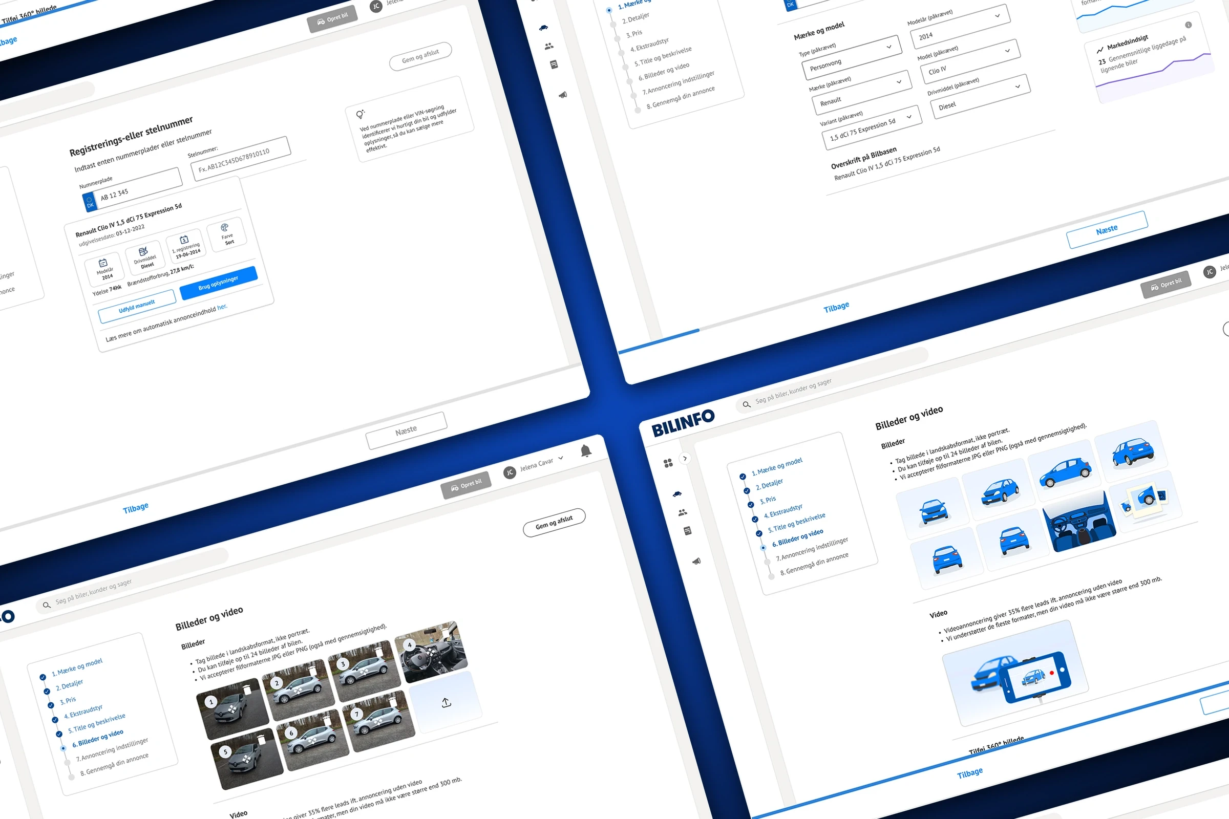
Tender requirements and business rules could only tell us part of the story. Across several visits to Cardiff, we observed Transport for Wales teams using the existing systems, paying attention to where staff hesitated, what they relied on and where technology got in their way.
Seeing the work first-hand revealed how movement, divided attention and passenger conversations shaped every interaction. These observations grounded our approach in the realities around the screen and led to three main focus areas for the design:
01
Design for movement and divided attention.
Conductors are standing, walking through moving trains, talking to passengers and often operating a handheld device with one hand.
02
Build on familiar ways of working.
Years of using paper-based workflows shaped strong mental models. Digitising these tasks meant preserving familiar patterns while reducing effort.
03
Make repeated tasks faster.
Ticket-office operators spend much of their working day selling the same tickets repeatedly.
Existing tools

Product approach
Different working environments needed different design priorities
The conductor and ticket-office experiences shared railway rules, but their day-to-day demands were different. Our approach reflected those differences.
For conductors, reliable access to essential tasks came first. We designed an almost entirely offline handheld experience so they could sell and manage tickets throughout the day without depending on connectivity. Only end-of-day tasks, including closing a shift and final reconciliation, required an internet connection.
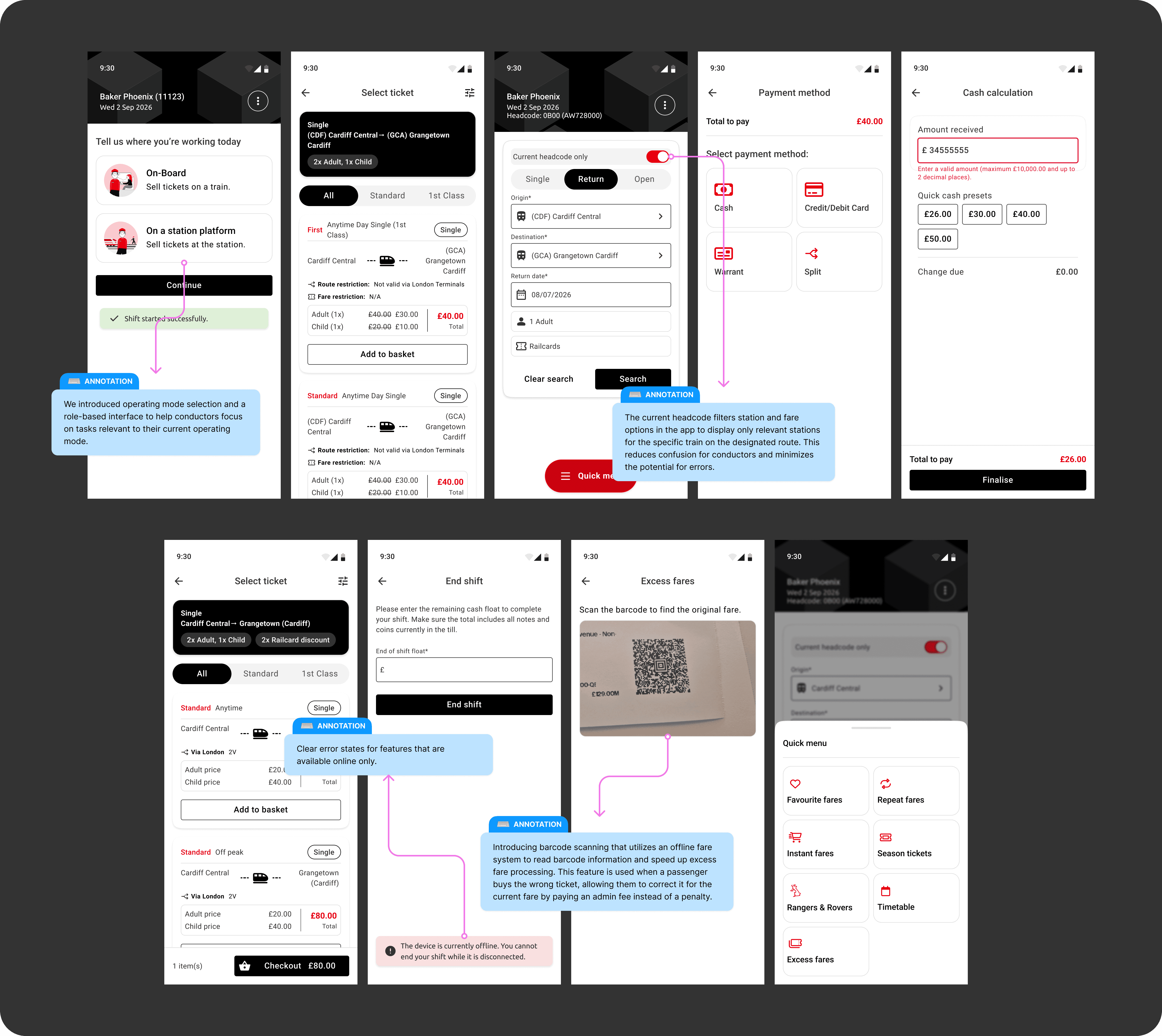

For ticket-office staff, we focused on repetition. Features such as repeat fares made frequently purchased tickets quicker to sell. The design priority was to reduce effort across tasks that staff might complete hundreds of times.

Across both experiences, research helped us decide which complexity the interface needed to expose and which the system could handle in the background.
Collaboration + AI
Using AI to navigate complexity
Working across six workstreams meant navigating extensive business rules, technical documentation and UK rail accreditation requirements. We created several custom GPTs focused on different areas of this information, helping the team find relevant guidance and cross-check design decisions more efficiently.
We also explored prototypes using simulated user profiles built from our qualitative research. These walkthroughs provided another way to question our assumptions and identify potential friction for further investigation. Their value was in generating questions to take back to the team and users; they could not establish how conductors would behave on a moving train.
One particularly useful application was supporting accreditation preparation. We used LLMs to compare proposed flows against documented requirements and support testing for potential gaps. This accelerated the checking process while leaving interpretation, verification and design decisions with the team.
Lessons
The system can be complex. The experience shouldn’t have to be.
This project reinforced that complexity does not disappear because an interface looks simple. Someone has to understand it, organise it and decide what the user should — and should not — have to think about. Designing professional tools means respecting the expertise of the people using them while protecting them from unnecessary system complexity. It also means designing for the environment around the screen: a moving train, unreliable connectivity, a queue at a ticket office, a conversation with a passenger, or a task repeated hundreds of times.