GoPass
2026
Redesigning mobile tickets for faster, frictionless validation
A validation-first mobile ticketing experience designed around real-world scanners, riders, and inspectors.
Team & my role:
Senior Product Designer working closely with a Product Manager and a cross-functional engineering team (three engineers). I owned UX and UI end-to-end, from discovery to delivery.

Overview
The ticket has to work in the real world
The challenge looked simple: the QR code was difficult to scan. But the deeper problem was bigger. A ticket has to work across physical validators, evolving ticket states, and agency requirements—while keeping the most important action obvious in the moment it matters. The redesign reframed the ticket from a static document into an interface for a real-world interaction under time pressure.
Designed for the moment of validation
The work prioritized scanning, ticket-state clarity, and the physical context around the screen—so the right information remains accessible without distracting from validation.
Problem
When digital tickets meet physical hardware
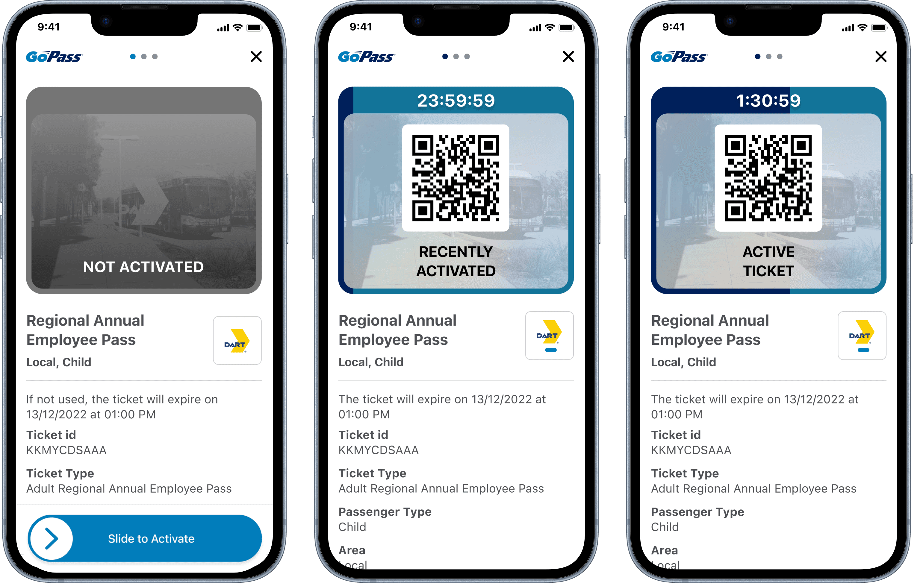
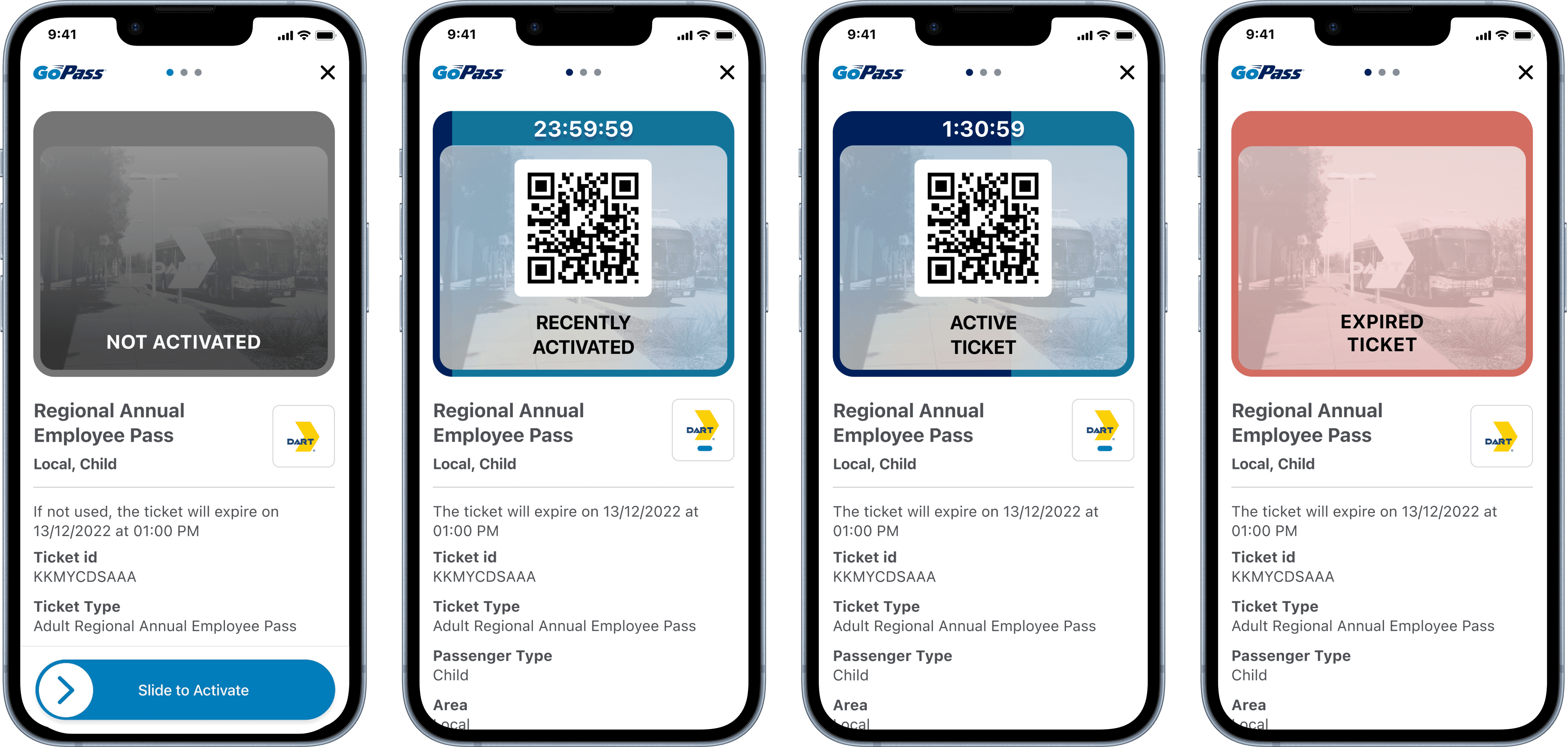
A mobile ticket can look perfectly usable on a screen and still fail in the real world. On the old design, the QR code sat at the bottom of the screen, so riders had to position, rotate, or reposition their phones at a validator. As new ticket states and information were added, the code risked being pushed even farther from reach. The brief was not simply to move the QR code. It was to design around the moment of validation: a rider often holding a phone in one hand, moving through a busy station, and needing a fast, confident scan with physical hardware. The ticket needed to support riders and transport agencies without losing that priority.
Research & solution
Designing around validation
Before redesigning the interface, we observed people using tickets in the environment where validation happens. This showed how riders positioned their phones, where they hesitated, and what happened when a scan did not work on the first attempt. The ticket is not used in isolation; it is part of a larger real-world interaction. That insight changed the hierarchy. The QR code became the primary focus of the experience, easier to reach and position at a validator, while essential ticket information stayed visible. Clearer states made active tickets immediately recognisable for both riders and inspectors.
Impact
Clearer moments, more confident validation
In the first month after launch, validation failures caused by incorrect phone positioning against the scanner fell from 16% to 4%—a 75% reduction. Prioritising the QR code made the ticket easier to position for scanning, while keeping essential information visible for riders and inspectors.
