PRODUCT DESIGN • RESEARCH
Redesigning mobile tickets for faster, frictionless validation
Redesigned mobile tickets to reduce validation friction and improve usability for commuters across multiple transport agencies.
Team & my role:
Lead Product Designer working closely with a Product Manager and a team of 2 engineers. I owned UX and UI end-to-end, from discovery to delivery.
Problem area
When digital tickets meet physical hardware
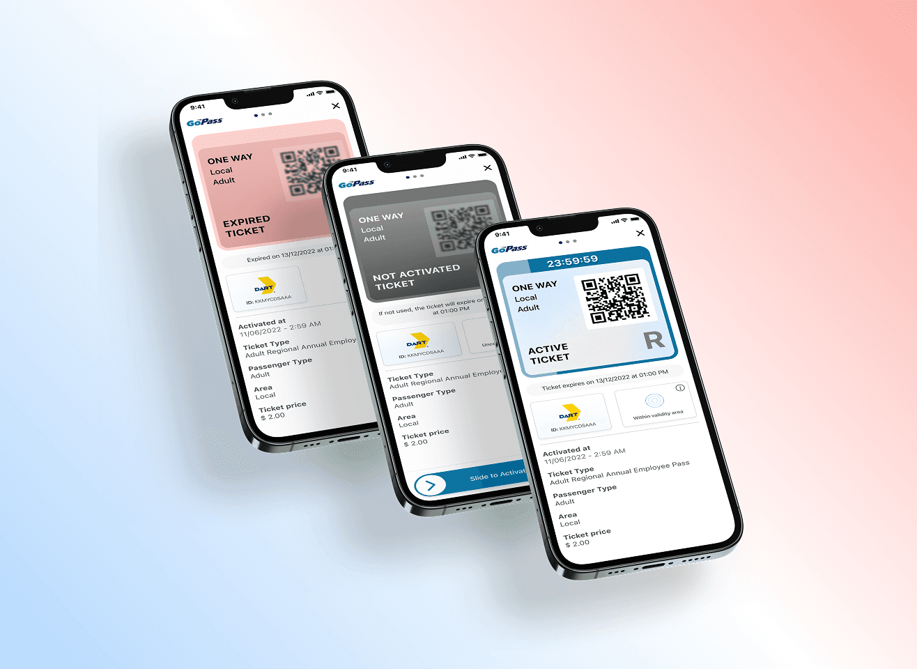
Users struggled to validate tickets on physical validators because the QR code was placed at the bottom of the screen. In real life, this led to awkward phone rotations and failed scans. At the same time, the product needed to support more ticket data and states, which risked pushing the QR code even further down and making validation even harder.
Constraints
The solution had to work as a white-label setup across multiple transport agencies with different validation flows. Some agencies rely only on visual validation, while others require active QR scanning. The experience had to support both without fragmenting the design system.
Solution
What we changed
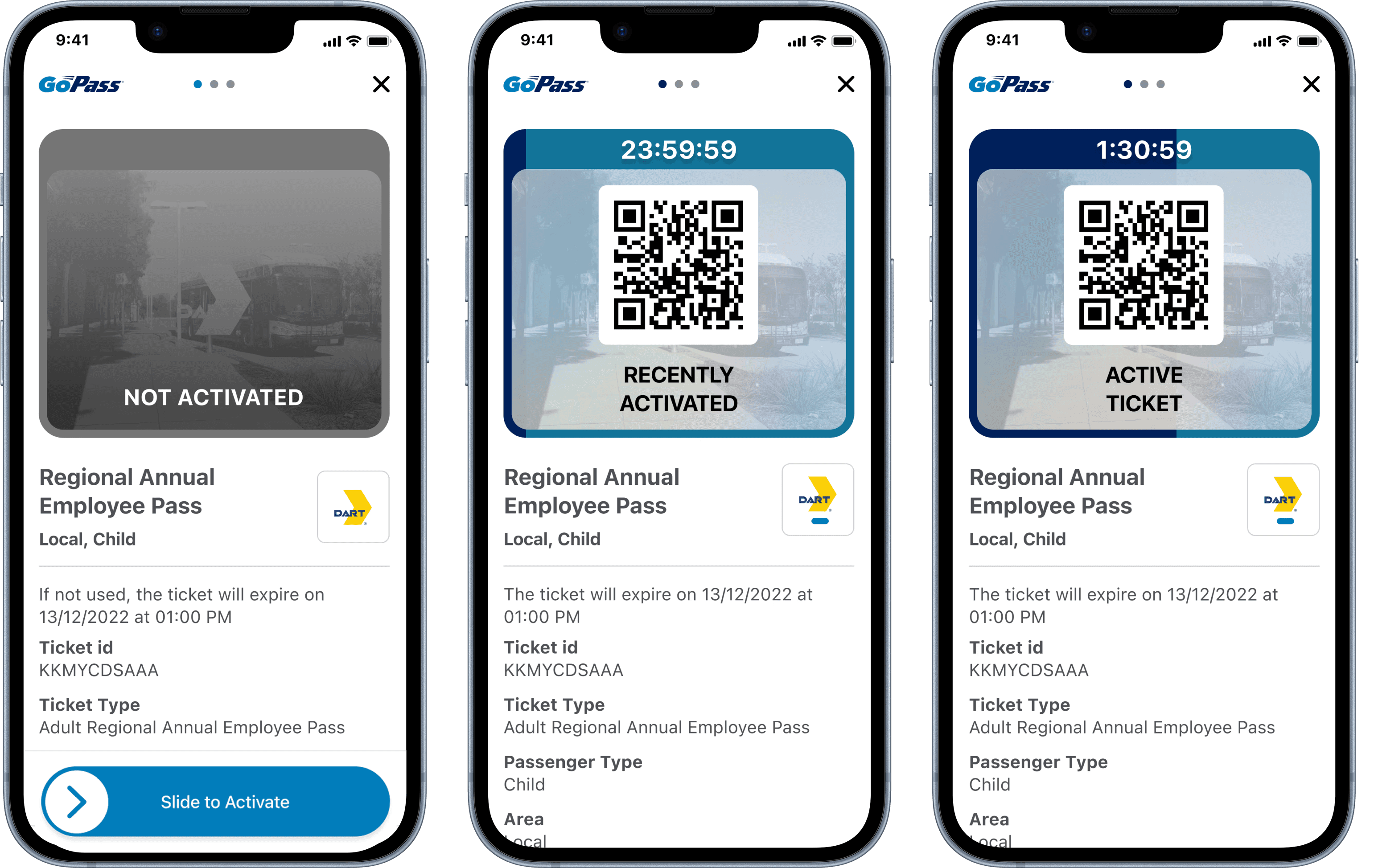
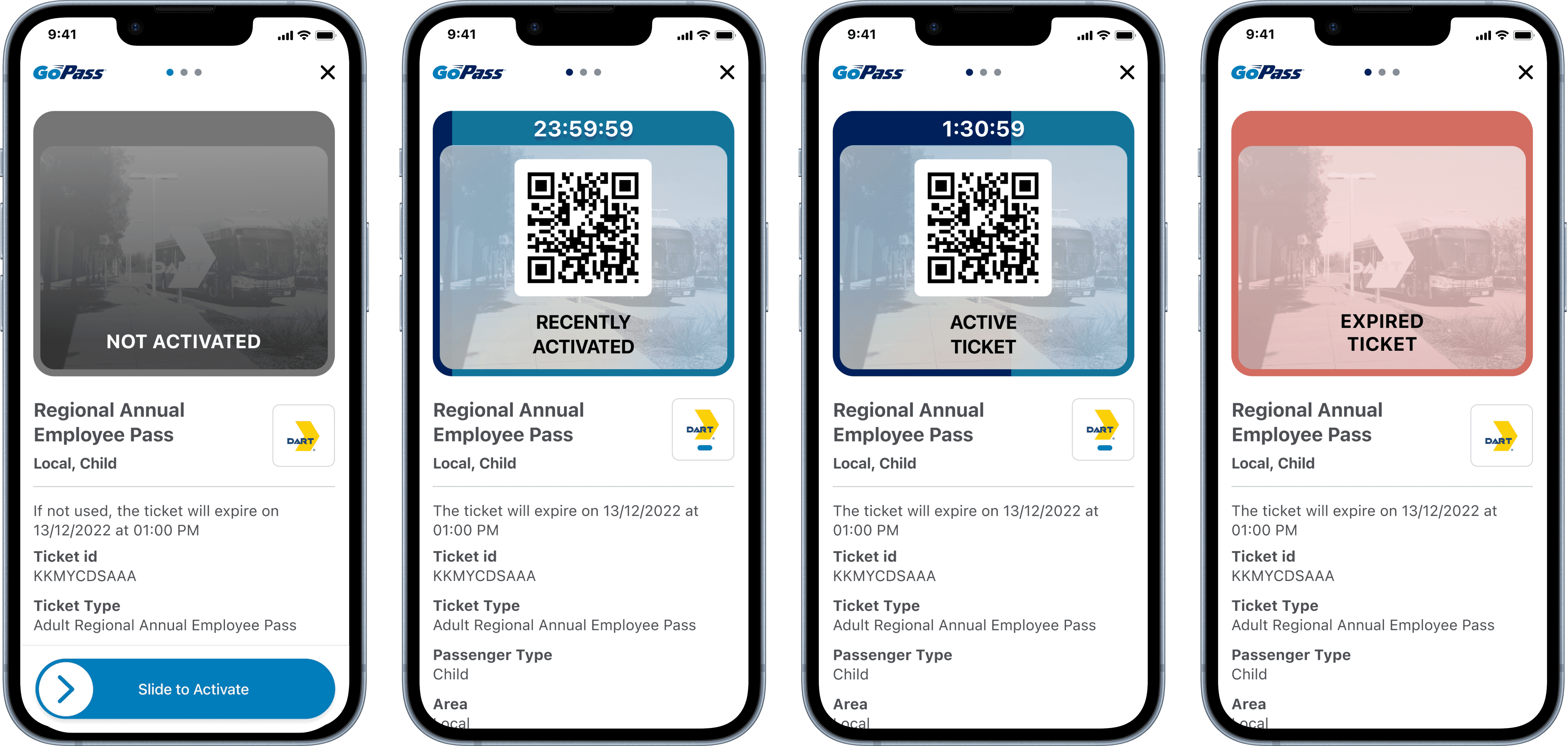
We restructured the ticket layout to prioritize QR code placement for real-world scanning on physical validators, making it easier to scan without awkward phone rotations. The overall information hierarchy was redesigned so that essential validation elements remain prominent, even as more ticket data and states are introduced. For agencies using visual validation, we introduced a subtle motion-based activation state and kept a short activation video to clearly signal when a ticket is active and valid. This allowed us to support different validation models within the same white-label setup, while keeping the experience consistent and easy to understand across agencies.
Learnings
Collecting feedback
Early feedback shows clear improvements in usability and visual clarity, with users reporting fewer issues during validation. The new ticket experience currently has a satisfaction score of 4.8/5, and we are monitoring validation success rates and support requests as the rollout continues.