PRODUCT DESIGN • RESEARCH
GoPass live activities and live updates
How we designed GoPass Live Activities and Live updates to elevate the rider experience
Team & my role:
Lead Product Designer working closely with a Product Manager and a cross-functional engineering team (2 engineers). I owned UX and UI end-to-end, from discovery to delivery.
Problem area
A game changer for rideshare
Coordinating pickups between riders and drivers is one of the hardest and most important things the GoPass app does. It takes a lot to get it right, but keeping riders informed in real time is key. If riders don’t get the right updates at the right moments, it can lead to a frustrating experience for everyone.
The GoPass app is great at sending these updates, but there’s a catch: we can’t always count on riders having the app open. We get it—riders are busy, often juggling a lot as they prepare for their trips. The real challenge isn’t what to tell them but how to make sure they see it.
Before Live Activities (iOS) and Live updates (Android), push notifications were the only way to share important updates. But notifications have their flaws:
• They’re cluttered: Important updates can get lost among promos and ads.
• They’re easy to miss: Look away for a moment, and you might not see them.
• They can go stale: Notifications don’t always reflect what’s happening right now.
The issue wasn’t notifications themselves—it was that critical updates needed a better way to reach riders. That’s where Live Activities/Live updates comes in. iOS and Android new feature gives us a dynamic, easy-to-access space for updates that are always clear, always current, and always right where riders need them.
Possibilities
A Sea of possibilities
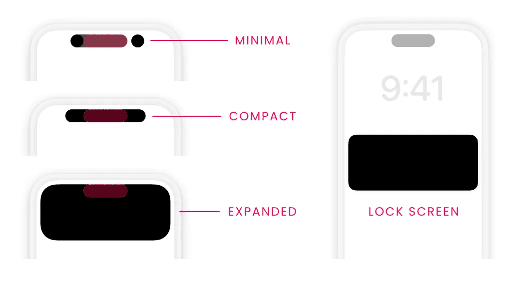
One of the most powerful features of Live Activities on iOS is their flexibility—they can adapt to different contexts by taking on four distinct forms:
• Minimal: A tiny surface within or next to the Dynamic Island, used when multiple Live Activities are running.
• Compact: Two small surfaces on either side of the Dynamic Island, combining to form one unified view when only one Live Activity is active.
• Expanded: A larger view that extends from the Dynamic Island, showing more detailed updates (or appearing when pressed).
• Lock Screen: Displays on the lock screen and as a banner notification when the phone is unlocked.
This adaptability is amazing because it allows Live Activities to integrate seamlessly across the iOS experience.
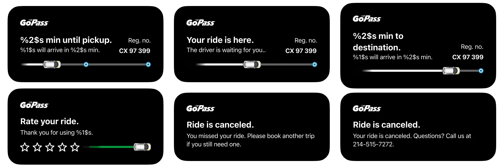
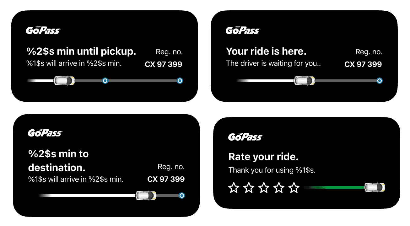
However, it also means designers must create four versions of each Live Activity layout. For simple cases—like a sports scoreboard with one state—this isn’t too tricky. But for us, with multiple possible states, and several opreators it’s a much bigger challenge. 😅
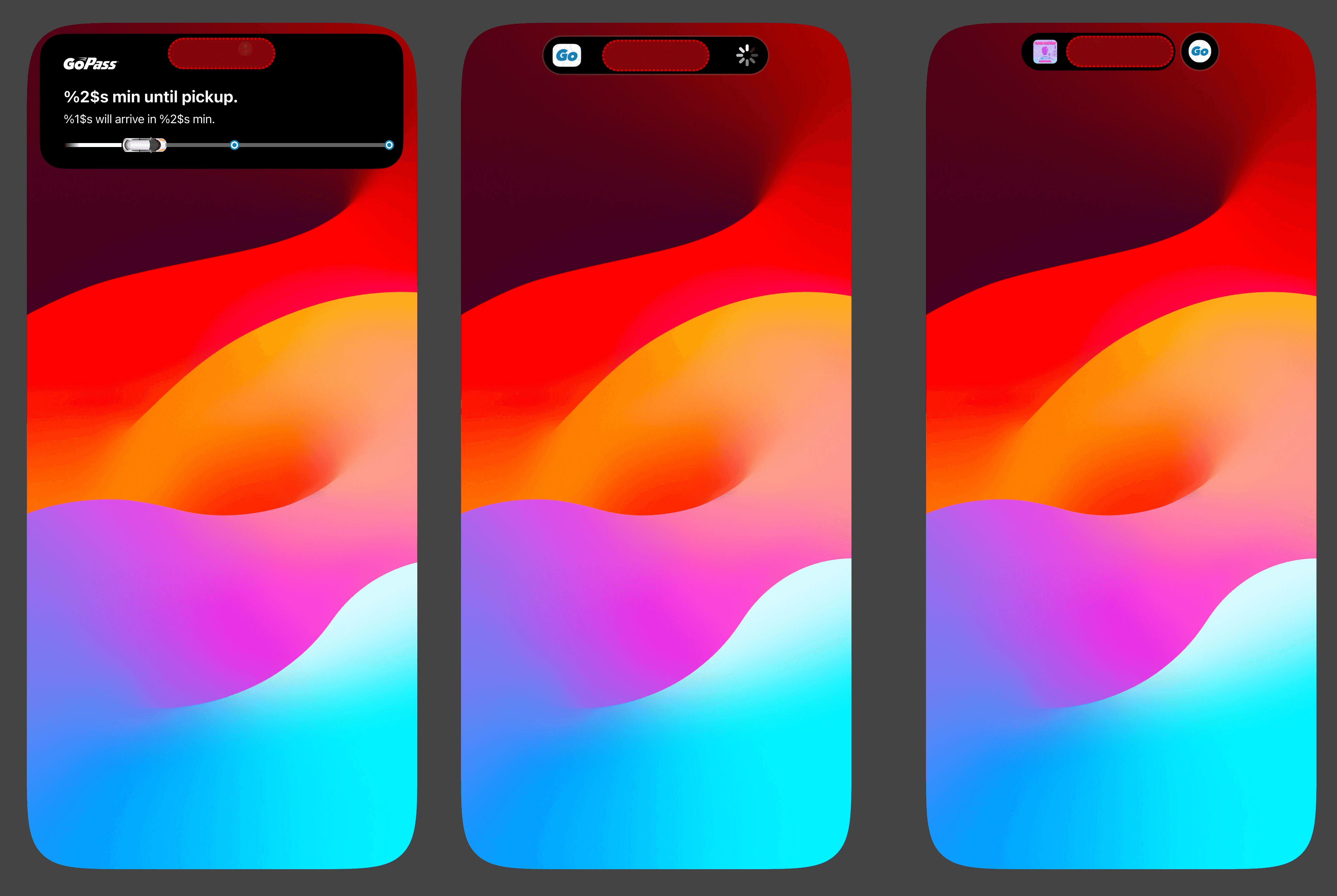
iOS Live Activities
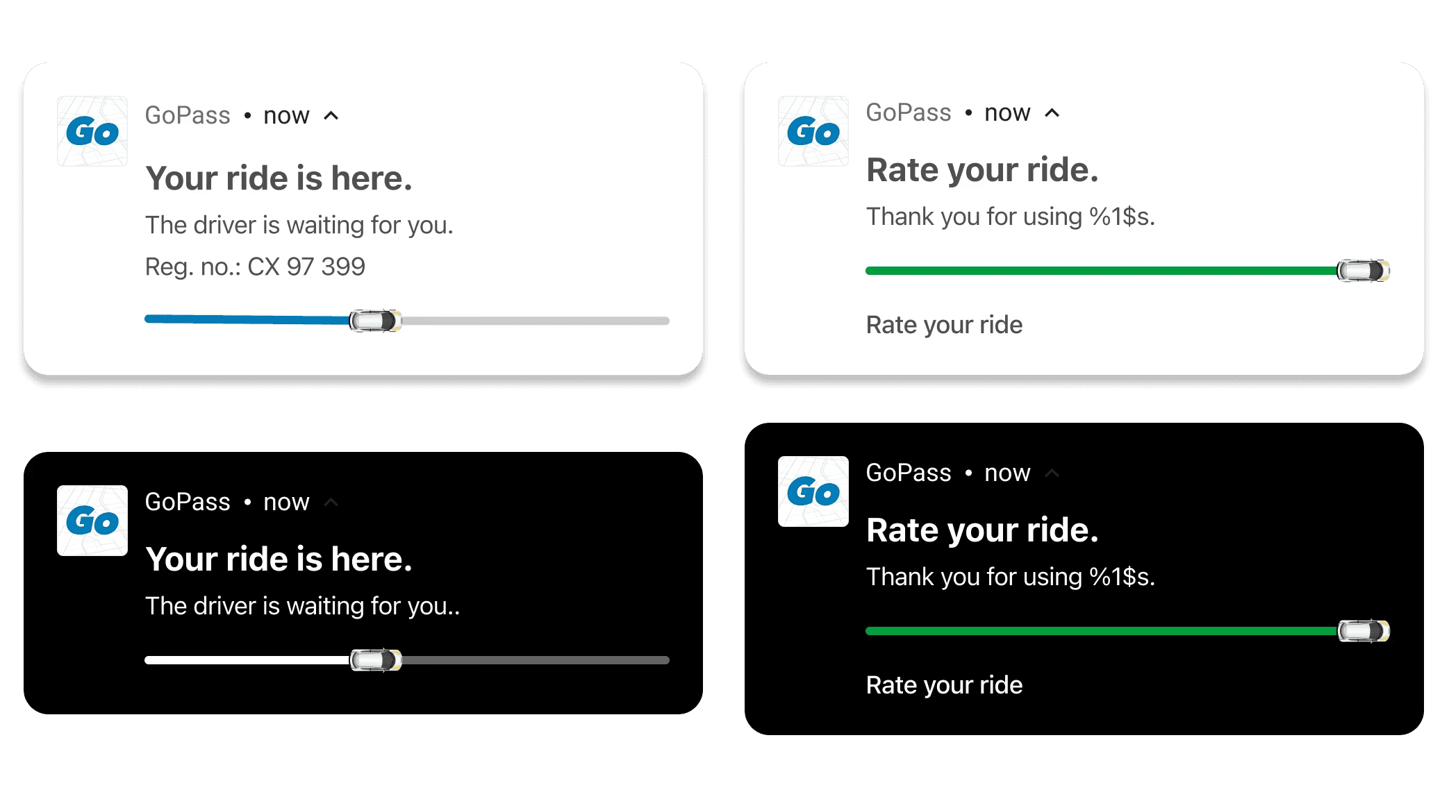
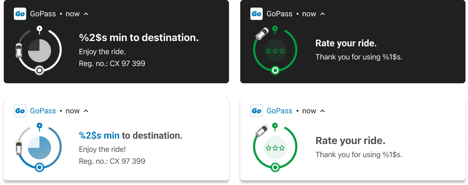
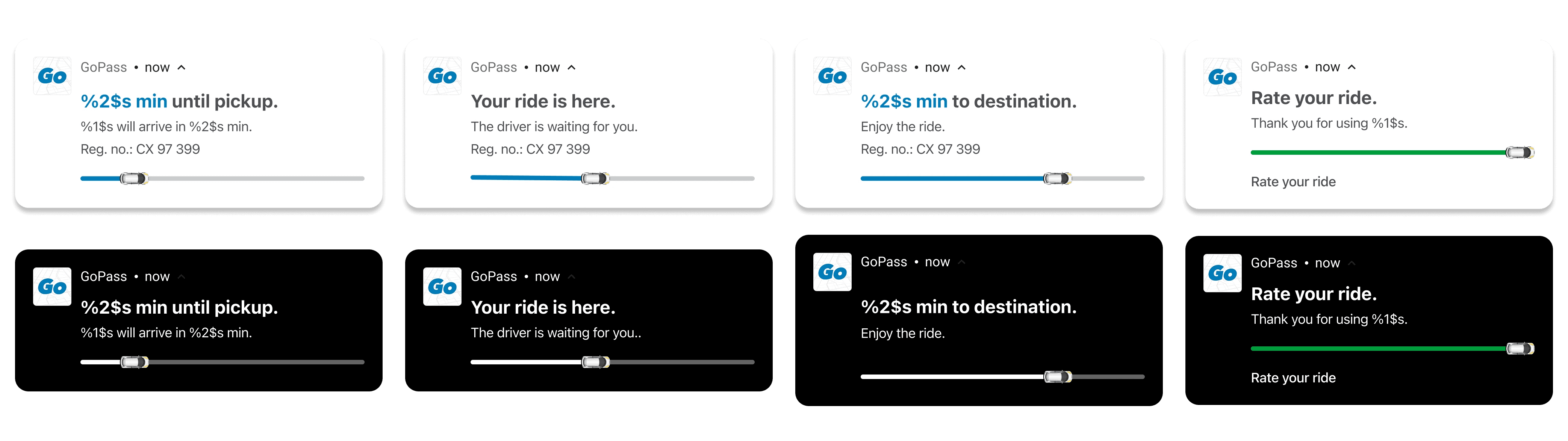
On the other hand, live updates come with their own set of limitations. Although we continuously strive to align experiences across platforms, we have respected the constraints we are working within and embraced them, allowing small differences between platforms to remain.
Android Live Updates
Learnings
Some of our learnings from working with dynamic islands
Embrace your limitations
Live Activities are a fantastic addition to iOS, but they come with restrictions on size, animation, and functionality. Instead of trying to push those limits or work around them, use them to your advantage. Let the constraints guide you to focus on the content that truly matters—and to leave out what doesn’t.
At the same time, the project presented another challenge: on Android, dynamic islands are only available starting from version 16. This posed the risk of releasing a feature with a low adoption rate, leaving the majority of users unsupported. To address this, a separate design was implemented to mimic the desired behavior and ensure compatibility with earlier Android versions.